
Race, Income, and Test Scores

Yesterday, RealClearBooks ran my 20th-anniversary review of Richard Herrnstein and Charles Murray's The Bell Curve. One thing I didn't have room to cover, though, was one of the more striking assertions in the book: The authors claim that there isn't much of a racial gap in income once IQ is taken into account.
As it happens, there's an updated version of the data set Herrnstein and Murray used, the 1979 National Longitudinal Survey of Youth (NLSY): The study began following a new cohort of adolescents (age 12-16) in 1997. I dug into the new data to see what I could find.
Having majored in journalism, I kept my analysis simple: I merely grabbed all the black and non-Hispanic white males who had both test-score data from when they were young (a percentile rank on the math and verbal portions of the ASVAB, a battery of cognitive tests) and income data from 2011 (when they were around their late 20s). Someone with more statistical training can no doubt take this analysis further -- with weights, adjustments for age, controls for other variables, etc. -- but I found some striking things just in the raw data.
The first thing I did, ignoring test scores, was to rank white and black men by income separately. Here are the results:

The difference may not be visually striking, but it's substantial, with the median white male earning about 30 percent more ($35,000) than the median black male ($27,000). This won't be a surprise to anyone familiar with inequality statistics.
Also note that the maximum income is the same for groups. This isn't a weird coincidence, but happens because the data are "top-coded" -- to protect the privacy of those participating in the survey, the NLSY groups together the top 2 percent of earners and assigns each of them the mean income for the whole group.
Here is a much messier graph, with all of the men plotted by ASVAB percentile and income (and the top-coding much more obvious). The lines approximate the median income for each ASVAB score.
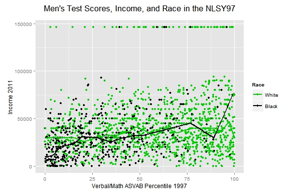
A lot of interesting stuff here. First, if you look just at the folks rich enough to be top-coded, you see that they come disproportionately from the top half (and especially the top quarter) of the ASVAB distribution. For the top four-fifths of the ASVAB distribution, blacks and whites who score the same indeed tend to earn similar incomes, with the median lines weaving back and forth across each other. At the bottom of the ASVAB distribution, however, blacks earn much less than whites who score the same. (The income spike for blacks with very high ASVAB scores seems to stem from a low sample size in that range.) And especially for whites, the income advantage of a higher ASVAB score isn't as great as you might expect -- whites with low scores tend to earn around $30,000, whites with high scores closer to $40,000, for example.
Obviously, there are a million ways we can go from here: education, incarceration, the recession, employment discrimination, affirmative action, etc. I'll be interested to see the data that's collected a few years from now, when the educated have had more time to establish careers and the economy has (hopefully) recovered. But to avoid stretching my abilities even further, I'll just encourage others to explore the data. You can customize your own data set here, download the spreadsheet I used here, and see the R code I used to make the above plots here.
Robert VerBruggen is editor of RealClearPolicy. Twitter: @RAVerBruggen